Understanding the way colour is recorded and processed in the broadcast chain is vital to ensuring its safe passage. Whilst there are plenty of people who work in part of the broadcast chain which shouldn’t touch colour, being purely there for transport, the reality is that if you don’t know how colour is dealt with under the hood, it’s not possible to any technical validation of the signal beyond ‘it looks alright!’. The problem being, if you don’t know what’s involved in displaying it correctly, or how it’s transported, how can you tell?
Ollie Kenchington has dropped into the CPV Common Room for this tutorial on colour which starts at the very basics and works up to four case studies at the end. He starts off by simply talking about how colours mix together. Ollie explains the difference between the world of paints, where mixing together is an act of subtracting colours and the world of mixing light which is about adding colours together. Whilst this might seem pedantic, it creates profound differences regarding what colour two mixed colours create. Pigments such as paints look that way because they only reflect the colour(s) you see. They simply don’t reflect the other colours. This is why they are called subtractive; shine a blue light on something that is pure red, and you will just see black, because there is no red light to reflect back. Lights, however, provide lights and look that way because they are sending out the light you see. So mixing a red and blue light will create magenta. This is known as additive colour mixing and introduces color.adobe.com which lets you discover new colour palettes.
The colour wheel is next on the agenda which Ollie explains allows you to talk about the amplitude of a colour – the distance the colour is from the centre of the circle – and the angle that defines the colour itself. But as important as it is to describe a colour in a document, it’s all the more important to understand how humans see colours. Ollie lays out the way that rods & cones work in the eye. That there is a central area that sees the best detail and has most of the cones. The cones, we see, are the cells that help us see colour. The fact there aren’t many cones in our periphery is covered up by our brains which interpolate colour from what they have seen and what they know about our current environment. Everyone is colour blind, Ollie explains, in our peripheral vision but the brain makes up for it all from what it knows about what you have seen. Overall, in your eye, sensitivity to blue is by far much less than that you have for green and then red. This is because, in evolutionary terms, there is much less important information gained by seeing detail in blue than in green, the colour of plants. Red, of course, helps understanding shades of green and brown which are both colours native to plants. The upshot of this, Ollie explains, is that when we come to processing light, we have to do it in a way that takes into account the human sensitivity to different wavelengths. This means that we can show three rectangles next to each other, red, green and blue, see them as similar brightnesses but then see that under the hood, we’ve reduced the intensity of the blue by 89 per cent, the red by 70 and the green by only 41. When added together, these show the correct greyscale brightness.
The CIE 1931 colour space is the next topic. The CIE 1931 colourspace shows all the colours that the human eye can see. Ollie demonstrates, by overlaying it on the graph that ITU-R Rec.709 – broadcast’s most well-known and most widely-used colourspace only provides 35% coverage of what our eyes can see. This makes the call for Rec 2020 from the proponents of UHD and ‘better pixels’, which covers 75%, all the more relevant.
Ollie next focuses in on acquisition talking about CMOS chips in cameras which are monochromatic by nature. As each pixel of a CMOS sensor only records how many photons it received, it is intrinsically monochrome. Therefore, in order to show colour, you need to put a Bayer colour filter array in front. Essentially this describes a pattern of red, blue and green filters above this pixel. With the filter in place, you know that the value you read from a given pixel represents just that single colour. If you put red, blue and green filters over a range of pixels on the sensor, you are able to reconstruct the colour of the incoming scene.
Ollie then starts to talk about reducing colour date. We an do this at source by only recording 8, rather than 10-bits of colour, but Ollie shows us a clear demonstration of when that doesn’t look good; typically 8-bit video lets itself down on sunsets, flesh tones or similar subtle. gradients. The same principle drives the HDR discussion regarding 10-bit Vs. 12 bit. With PQ being built for 12-bit, but realistic live production workflows for the next few years being 10-bit which HLG expects, there is plenty of water to go under the bridge before we see whether PQ’s 12-bit advantage really comes into its own outside of cinemas. Ollie also explains colour subsampling which gets a thorough explanation detailing not only 4:4:4 and 4:2:2 but also the less common examples.
The next section looks at ‘scopes’ also known as ‘waveform monitors’. Ollie starts with the histogram which shows you how much of your picture is a certain brightness helping understanding how exposed your picture is overall. With the histogram, the horizontal axis shows brightness with the left being black and the right being white. Whereas the waveform shows the brightness on the horizontal and then the x axis shows you the position in the picture that a certain brightness happens. This allows you to directly associate brightness values with objects in the scene. This can be done with the luma signal or the separate RGB which then allows you to understand the colour of that area. Vectorscope
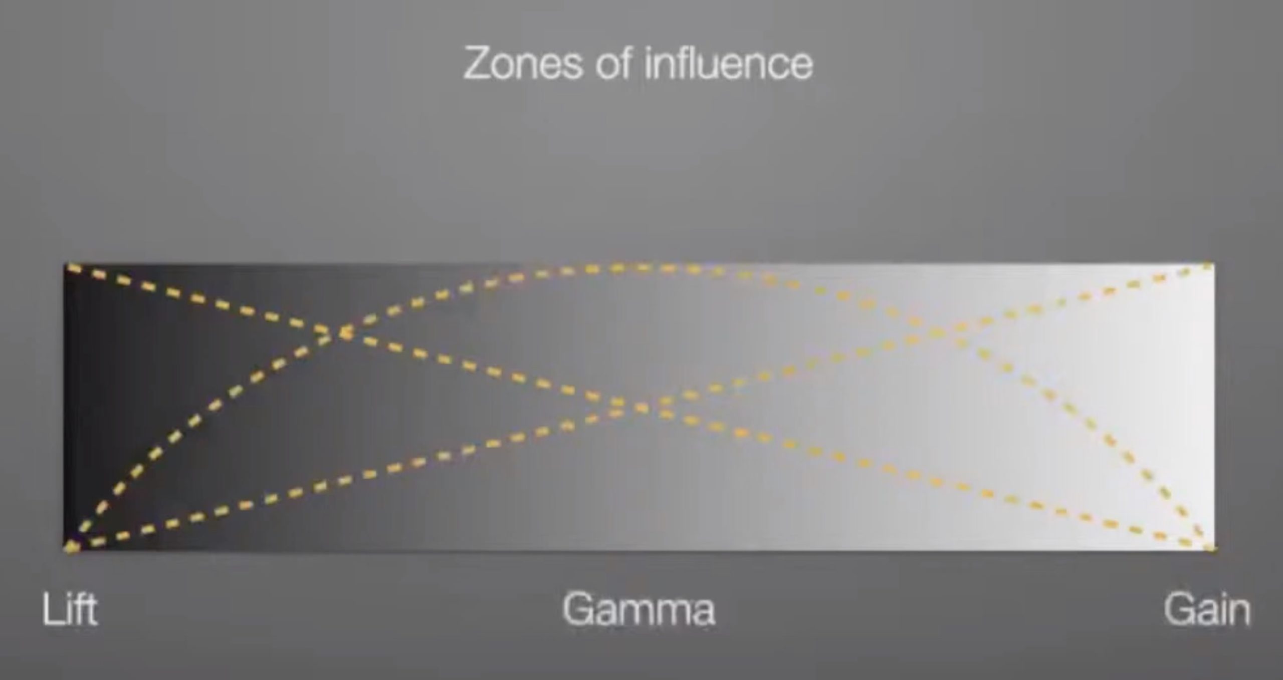
Ollie then moves on to discussing balancing contrast looking at lift (lifting the black point), gamma (affects central), gain (altering the white point) and mixing that with shadows, midtones and highlights. He then talks about how the surroundings affect your perceived brightness of the picture and shows it with great boxes in different surrounds. Ollie demonstrates this as part of the slides in the presentation very effectively and talks about the need for standards to control this. When grading, he discusses the different gamma that screens should be set to for different types of work and discusses the standard which says that the ambient light in the surrounding room should be about 10% as bright as the screen displaying pure white.
The last part of the talk presents case studies of programmes and films looking at the way they used colour, saturation, costume and lighting to enhance and underwrite the story that was being told. This takeaway is the need to think of colour as a narrative element. Something that can be informed from and understood by wardrobe, visual look intention, wardrobe and lighting. The conversation about colour and grading should start early in the filming process and a key point Ollie makes is that this is not a conversation that costs a lot, but having it early in the production is priceless in terms of its impact on the cost and results of the project.
Watch now!
Speakers
 |
Ollie Kenchington Owner & Creative Director, Korro Films, Korro Academy |