Automatic assessment of video quality is essential for creating encoders, selecting vendors, choosing operating points and, for online streaming services, in ongoing service improvement. But getting a computer to understand what looks good and what looks bad to humans is not trivial. When the computer doesn’t have the source video to compare against, it’s even harder.
In this talk, Dr. Ahmed Badr from SSIMWAVE looks at how video quality assessment (VQA) works and goes into detail on No-Reference (NR) techniques. He starts by stating the case for VQA which is an extension, and often replacement for subjective scoring by people. Clearly this is time-consuming, can be more expensive due to involvement of people (and the time) plus requires specific viewing conditions. When done well, a whole, carefully decorated room is required. So when it comes to analysing all the video created by a TV station or automating per-title encoding optimisation, we know we have to remove the human element.
Ahmed moves on to discuss the challenges of No Reference VQA such as identifying intended blur or noise. NR VQA is a two-step process with the first being extracting features from the video. These features are then mapped to a quality model which can be done with a machine learning/AI process which is the technique which Ahmed analyses next. The first task is to come up with a dataset of videos which should be carefully chosen, then it’s important to choose a metric to use for the training, for instance, MS-SSIM or VMAF. This is needed so that the learning algorithm can get the feedback it needs to improve. The last two elements are choosing what you are optimising for, technically called a loss function, and then choosing an AI model for use.
The data set you create needs to be aimed at exploring a certain aspect or range of aspects of video. It could be that you want to optimise for sports, but if you need a broad array of genres, optimising for reducing compression or scaling artefacts may be the main theme of the video dataset. Ahmed talks about the millions of video samples that they have collated and how they’ve used that to create their metric called SSIMPLUS which can work both with a reference and without.
KPIs are under the microscope as Milan’s Video Tech meet up fights against the pandemic by having its second event online and focused on measuring, and therefore improving, streaming services.
Looking at ‘Data-Driven Business Decision Making‘, Federico Preli, kicks off the event looking at how to harness user data to improve the user experience. He explains this using Netflix’s House of Cards as an example. Netflix commissioned 2 seasons of House of Cards based not on a pilot, but on data they already have. They knew the British version had been a hit on the platform, they could see that the people who enjoyed that, also watched other films from Kevin Spacey or David Fincher (the director of House of Cards). As such, this large body of data showed that, though success was not guaranteed, there was good cause to expect people to be receptive to this new programme.
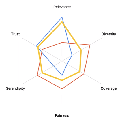
Federico goes on to explain how to balance recommendations based upon user data. A balance is necessary, he explains, to avoid a bubble around a viewer where the same things keep on getting recommended and not to exaggerate someone’s interests at the detriment of nuance and not representing the less prominent predilections. He outlines the 5 parts of a balanced recommendations experience: Serendipity, diversity, coverage, fairness & trust. Balancing these equally will provide a rounded experience. Finally, Federico discusses how some platforms may choose to under invest in some of these due to the nature of their platforms. Relevance, for instance, may be less important for an ultra-niche platform where everything has relevance.
‘Performance Video KPIs at the Edge‘ is the topic of Luca Moglia‘s talk. A media solutions engineer from Akamai, he looks at how to derive more KPI information from logs at the edge. Whilst much data comes from a client-side KPI, data directly reported by the video player itself to the service. Client-side information is vital as only the client knows on which button you clicked, for instance and how long you spent in certain parts of the GUI. But in terms of video playback, there is a lot to be understood by looking at the edge, the part of the CDN which is closest to the client.
One aspect that client-side reporting doesn’t cover is use of the platform by clients which aren’t fully supported meaning they report back less information. Alternatively, for some services, it may be possible to access them with clients which don’t report at all. Depending on how reporting is done, this could be blocked by ad blockers or DNS rules. As such, this is an important gap which can be largely filled by analysis of CDN logs. This allows you to enhance the data analysis done elsewhere and validate it.
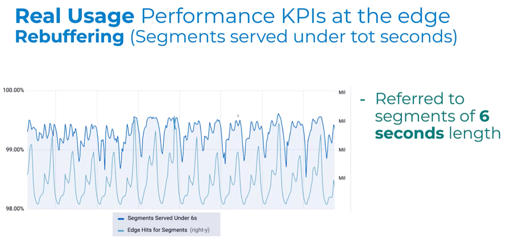
Luca gives examples of KPIs that can be measured or inferred from the edge, such as ‘hand-waving latency’ which can be understood from the edge-to-origin latency and time to manifest. He also shows an example graph analysing the number of segments served at the edge within the segment duration time. This helps indicate how many streams weren’t rebuffering. Overall, Luca concludes, analysing data from the edge helps track improvements, gives you better visibility on consumer/global events and allows you to enhance the performance of the platform.
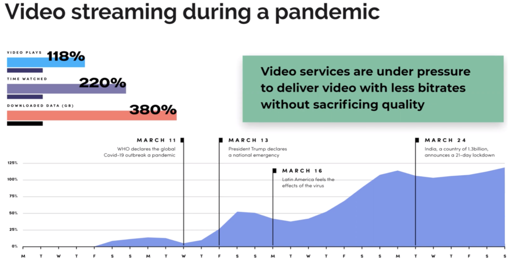
Bitmovin’s Andrea Fassina covers ‘Client KPIs – Five Analytics Metrics That Matter‘ which he summarises at the beginning of his talk ahead of explaining each individually. ‘Impressions & Total Hours Watched’ is first. This metric has really shown its importance as the SARS-CoV-2 pandemic has rolled around the globe. Understanding how much more people are watching is important in understanding how your platform is reacting. After all, if a platform is struggling this could be for many reasons that are correlated with, but not because of, more hours streamed. For instance, in boxing matches, it’s often the payment system which struggles before the streaming does.
Video startup time is next. Andrea explains the statistics of lost viewers as your time-to-play increases. You can look at startup time across each device and see where the low-hanging fruit for improvements and prioritise your work. This metric can be extended to ad playing and DRM load time which need to be brought into the overall equation.
Third is Video Bitrate Heatmap which allows you to see which type of chunks are most used and, similarly, which rungs on your ABR ladder aren’t needed (or could be improved.) The fourth KPI discussed is Error Types and Codes. Analysing codes generated can give you early warning to issues and allow you to understand whether you suffer more problems than the industry average (6.6%) but also proactively talk to connectivity providers to reduce problems. Lastly, Andrea explains how Rebuffering percentage helps understand where there are gaps in your service in terms of devices/apps which are particularly struggling.
Source: Andrea Fassina, Bitmovin
‘Video Quality Metrics‘ rounds off the session as Fabio Sonnati tackles the tricky problem of how to know what quality of video each viewer is seeing. Given that the publisher has each and every chunk and can view them, many would think this would mean you could see exactly what each stream would look like. But a streaming service can only see what each chunk looks like on their device in their environment. When you view a chunk encoded at 1080i on an underpowered SD device, what does the user actually see and would they have been better receiving a lower resolution, lower bitrate chunk instead?
In order to understand video quality, Fabio briefly explains some objective metrics such as VMAD, SSIM and PSNR. He then discusses the way that Sky Italia have chosen to create their own metric by combining metrics, subjective feedback and model training. The motivation to do this, to tailor your metric to the unique issues that your platform has to contend with. This metric, called SynthEYE, has been expanded to be able to run without a reference – i.e. it doesn’t require the source as well as the encoded version. Fabio shows results of how well SynthEYE Absolute predicts VMAF and MOS scores. He concludes by saying that using an absolute metric is useful because it gives you the ability to analyse chunk-by-chunk and then match that up with resolution and other analytics data to better understand the performance of the platform.
Update: Unfortunately CVP choose to take down this video within 12 hours of this article going live. But there’s good news if you’re interested in HDR. Firstly, you can find the outline and some of the basics of the talk explained below. Secondly, at The Broadcast Knowledge there are plenty of talks discussing HDR! Here’s hoping CVP bring the video back.
Why is High Dynamic Range is like getting a giraffe on a tube train? HDR continues its ascent. Super Bowl LIV was filmed in HDR this year, Sky in the UK has launched HDR and many of the big streaming services support it including Disney+, Prime and Netflix. So as it slowly takes its place, we look at what it is and how it’s achieved in the camera and in production.
Neil Thompson, an Sony Independent Certified Expert, takes a seat in the CVP Common Room to lead us through HDR from the start and explain how giraffes are part of the equation. Dynamic Range makes up two thirds of HDR, so he starts by explaining what it is with an analogy to audio. When you turn up the speakers so they start to distort, that’s the top of your range. The bottom is silence – or rather what you can hear over the quiet hiss that all audio systems have. Similarly in cameras, you can have bright pixels which are a different brightness to the next which represents the top of your range, and the dithering blacks which are the bottom of your range. In video, if you go too bright, all pixels become white even if the subject’s brightness varies which the equivalent of the audio distortion.
With the basic explanation out of the way, Neil moves on to describing the amount or size of dynamic range (DR) which can be done either in stops, contrast ratio or signal to noise ratio. He compares ‘stops’ to a bucket of water with some sludge at the bottom where the range is between the top of sludge and the rim of the bucket. One stop, he explains, is a halving of the range. With the bucket analogy, if you can go half way down the bucket and still hit clear water, you have 1 stop of dynamic range. If you can then go a quarter down with clean water, you have 2 stops. By the time you get to 1/32nd you have 5 stops. If going to 1/64 of the height of the bucket means you end up in the sludge, your system has 5 stops of dynamic range. Reducing the sludge so there’s clear water at 1/64th the height, which in cameras means reducing the noise in the blacks, is one way of increasing the dynamic range of your acquisition.
Update: Unfortunately CVP choose to take down this video within 12 hours of this article going live. But there’s good news if you’re interested in HDR. Firstly, you can find the outline and some of the basics of the talk explained below. Secondly, at The Broadcast Knowledge there are plenty of talks discussing HDR! Here’s hoping CVP bring the video back.
Neil looks next at the range of light that we see in real life from sunlight to looking at the stars at night. Our eye has 14 stops of range, though with our iris, we can see the equivalent of 24 stops. Similarly, cameras use an iris to regulate the light incoming which helps move the restricted dynamic range of the camera into the right range of brightness for our shot.
Of course, once you have gathered the light, you need to display it again. Displays’ ability to produce light is measured in ‘nits’, which is the amount of light per metre squared. Knowing how many nits a displays helps you understand the brightness it can show with 1000 nits, currently, being a typical HDR display. Of course, dynamic range is as much about the blacks as the brightness. OLED screens are fantastic at having low blacks, though their brightness can be quite low. LEDs, conversely, Neil explains, can go very bright but the blacks do suffer. You have to also take into account the location of a display device to understand what range it needs. In a dim gallery you can spend longer caring about the blacks, but many places are so bright, the top end is much more important than the blacks.
With the acquisition side explained, Neil moves on to transmission of HDR and it’s like getting a giraffe on a tube train. Neil relates the already familiar ‘log profiles’. There are two HDR curves, known as transfer functions, PQ from Dolby and HLG (Hybrig Log Gamma). Neil looks at which profiles are best for each part of the production workflow and then explains how PQ differs from HLG in terms of expressing brightness levels. In HLG, the brightest part of the signal tells the display device to output as brightly as it can. A PQ signal, however, reserves the brightest signal for 10,000 nits – far higher than displays available today. This means that we need to do some work to deal with the situation where your display isn’t as bright as the one used to master the signal. Neil discusses how we do that with metadata.
Finishing off the talk, Neil takes questions from the audience, but also walks through a long list of questions he brought along including discussing ‘how bright is too bright?’, what to look for in an engineering monitor, lighting for HDR and costs.
Video quality is a key part of user experience, so understanding how different parts of your distribution chain can affect your video in different ways is an important factor ensuring continued quality in the service and quick fault finding where problems are reported.
Abdul Rehman from SSIMWAVE speaks at the Kitchener-Warterloo Video Technology Meetup explaining both subjective quality assessment where humans judge the quality of the video and objective quality assessments where computers analyse, often terabytes, of video to assess the quality.
Starting with a video showing examples of different problems that can occur in the chain, Abdul explains how many things can go wrong including lost or delayed data, incorrect content and service configuration checks. Display devices, nowadays, come in many shapes, sizes and resolutions which can, in turn, cause impairments with display as can the player and viewing conditions. These are only around half of the different possibilities which include the type of person – a golden eye, or a pure consumer.
In order to test your system, you may need test codecs and you will need test content. Abdul talks about subject rated databases which have images which have certain types of distortions/impairments. After seeing many examples of problem images, Abdul asks the question of who to deal with natural images which look similar or deliberate use, for creative purposes, of distorted videos.
Subjective video quality assessment is one solution to this since it uses people who are much better at detecting creative quality than computers. As such, this avoids many false positives where video may be judged as bad, but there is intent in the use. Moreover, it also represents direct feedback from your target group. Abdul talks through the different aspects of what you need to control for when using subjective video quality assessment in order to maximise its usefulness and allow results from different sessions and experiments to be directly compared.
This is to be compared against objective video quality assessment where a computer is harnessed to plough through the videos. This can be very effective for many applications meaning it can shine in terms of throughput and number of measurements. Additionally, it can make regression testing very easy. The negatives can be cost, false positives and sometimes speed – depending on the application. You then can take your pick of algorithms such as MS-SSIM, VMAF and others. Abdul finishes by explaining more about the benefits and what to look out for.
Views and opinions expressed on this website are those of the author(s) and do not necessarily reflect those of SMPTE or SMPTE Members.
This website is presented for informational purposes only. Any reference to specific companies, products or services does not represent promotion, recommendation, or endorsement by SMPTE